Adding a gradient as a background color to your an Android app can add extra interest and style and provide a great user experience.
In this post, I will walk you through the steps of how to add a gradient background to your Android app including code samples.
To add a gradient background to your Android app, you need to do the following.
- Create a drawable resource with a selector root element
- Add an item, shape, and gradient element to the drawable resource
- On the gradient element, set the type of gradient to use and provide the start and end colors
- Set the background attribute on the layout resource of your fragment or activity to use the drawable resource
Creating a Gradient Background in Android using a Drawable Resource
In this section of this post, I will go through step by step of how to create a gradient background in Android using a drawable resource.
Create a Drawable Resource with a Selector Root Element
First, we will create a new drawable resource we will use for defining the gradient.
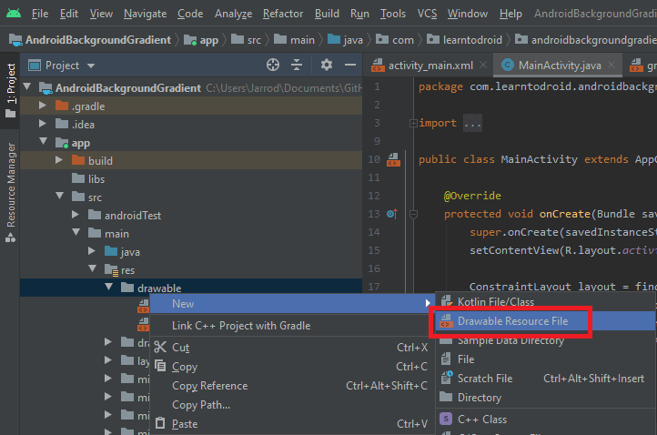
Switch your project in Android Studio into Project mode and navigate into the /app/src/main/res/drawable folder. Right click on the “drawable” directory, hover over the “New” item and select the “Drawable Resource File” item.
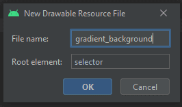
Then the “New Drawable Resource File” dialog will appear. Provide a file name for the drawable resource file you will use for the gradient background and set the root element to “selector”. Then press the “OK” button to create the drawable resource file.
For drawable resources in Android, the selector element allows you to define child item elements that are selected based on a particular state. For example, a button could have different child items with different visual characteristics depending on whether the button is currently selected, focused, or pressed.
You should end up with a drawable resource file that contains a single selector element.
Adding an Item, Shape, and Gradient Element to the Drawable Resource
Next, we will make some minor changes the drawable resource file we created in the previous step for the gradient background.
Within the selector element, we will add a single item element. Each option to be selected from a selector is represented by an item element. We will only create a single item element as we do not need to change the appearance of the gradient based on a particular state.
Within the item element, we will add a shape element. The shape element can be used to define different shapes such as rectangles, lines, ovals and rings. It allows you to customize the appearance of the shape by changing characteristics such as the corners, setting a gradient, adding padding, setting the width and height sizes, setting a solid fill color and changing the outline of the shape using the stroke element.
Within the shape element, we will add a gradient element which we will configure in the next step to define the appearance of the gradient we will use for the background.
See a code sample below of a drawable resource file containing the selector, item, shape and gradient elements.
Configuring the Gradient Element in the Drawable Resource
In this part of the tutorial, we will add attributes to the gradient element in the drawable resource we created for the gradient background to configure the appearance of the gradient.
This will involve selecting the pattern of gradient we want to use, setting the colors of the gradient, and setting the positioning, direction, and size of the gradient.
Setting the Gradient Pattern
There are three gradient pattern options to choose from in Android.
- Linear
- Radial
- Sweep
The gradient pattern is defined on the gradient element by adding the android:type attribute and setting the value to either “linear”, “radial” or “sweep”.
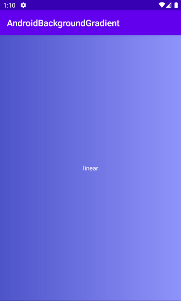
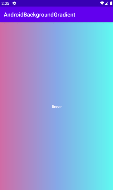
The linear gradient is the default gradient.
See a sample screenshot of a linear gradient used for a gradient background in Android below.
Sample drawable resource code for the linear gradient pattern.
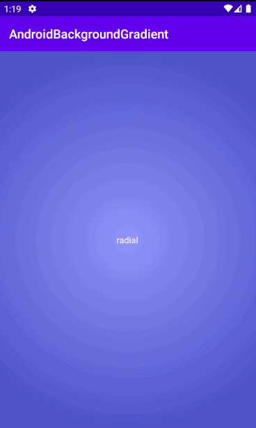
The radial gradient allows you to define a circular center color of the gradient using the start color attribute. The size of the circle can be defined using the gradient radius attribute.
See a sample screenshot of a radial gradient used for a gradient background in Android below.
Sample drawable resource code for the radial gradient pattern.
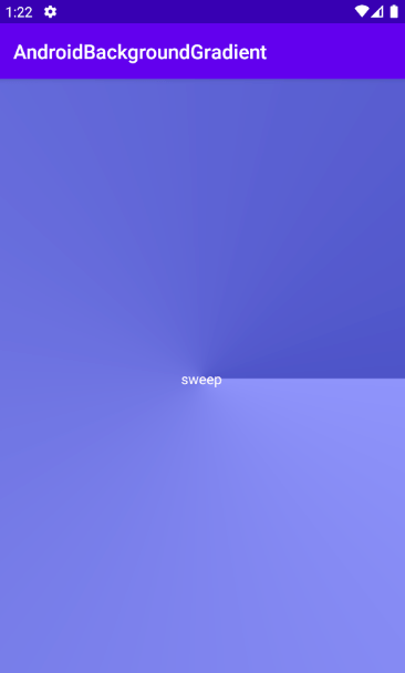
The sweep gradient offers a sweeping line gradient.
See a sample screenshot of a sweep gradient used for a gradient background in Android below.
Sample drawable resource code for the sweep gradient pattern.
Setting the Gradient Colors
There are up to three colors that can be defined on a gradient.
- Start color which is defined using the android:startColor attribute
- End color which is defined using the android:endColor attribute
- Center color which is defined using the android:centerColor attribute
These colors are set as attributes on the gradient element and the value can either be a hexidemical value representing a color e.g. “#FFFFFF” for the color white or they can be set using a color resource.
Using a color resource is a good method to use as it allows you to define all the colors you use across your Android app in a single location inside the colors.xml resource file in the /app/src/main/res/values directory to simplify any color branding changes you want to make to your Android app in the future.
See a sample colors resource file below containing three colors.
See a screenshot below of a linear gradient with the start, end and center colors defined.
This linear gradient with start, center and end colors was created using the following code.
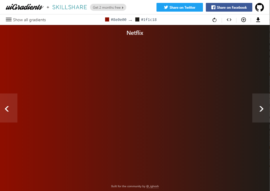
It is also worth mentioning there are some great free tools available on the internet that can help you find contrasting colors that are pleasant to look at to use for gradients.
Two tools I like are UI Gradients and Web Gradients.
Setting the Positioning, Direction, and Size of the Gradient
The center position of the gradient can be changed using the android:centerX and android:centerY attributes. The value of the centerX and centerY attributes is a relative position defined as a Float value ranging from 0 to 1.0.
The angle of the gradient can be set using the android:angle attribute using the Integer value representing the angle in degrees. This value must be a multiple of 45. A value of 0, which is the default value, represents an angle of left to right, a value of 90 represents an angle of bottom to top.
In the case of a radial gradient pattern, the size of the circle in the gradient can be changed using the android:gradientRadius attribute which will accept a Float value.
Setting Background Attribute to use the Drawable Resource
Now that we have finished creating the gradient in the drawable resource file, we will need to update the layout resource file for our Activity or Fragment to the drawable resource for the background.
In your layout resource file for your Activity or Fragment, locate the root layout whether that is a LinearLayout, RelativeLayout, ConstraintLayout, or something else, and set the android:background attribute on the layout to the drawable resource we created.
See a code sample for setting a drawable resource as a background for a ConstraintLayout for the main activity inside the activity layout resource file.
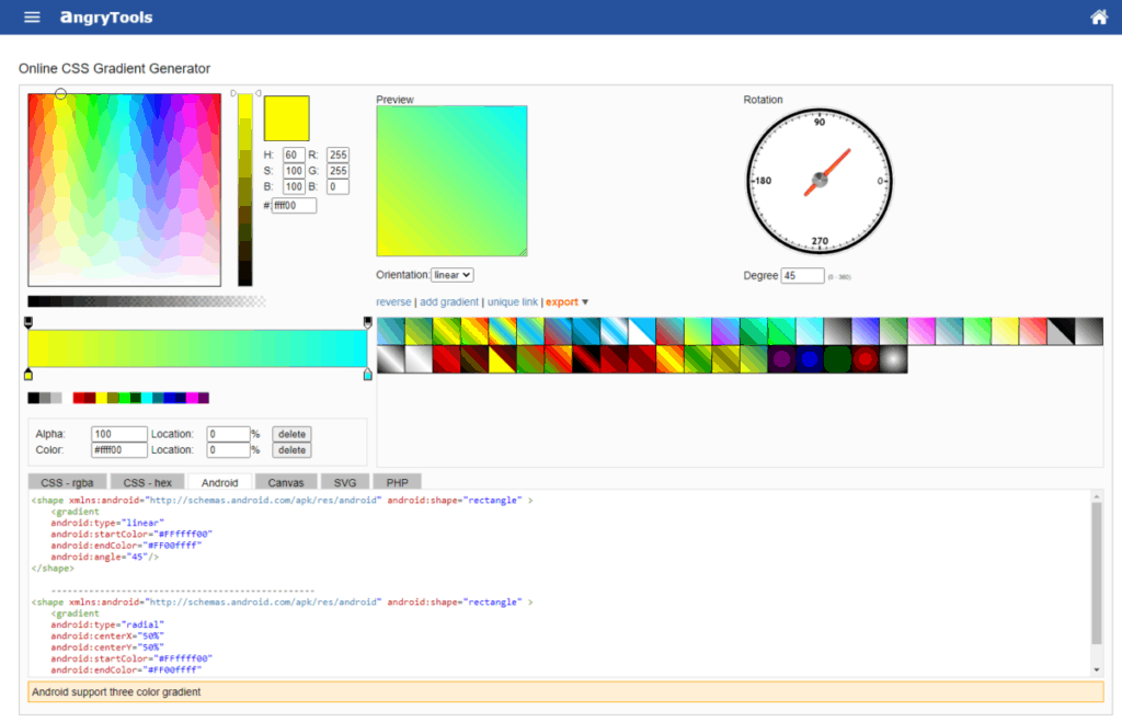
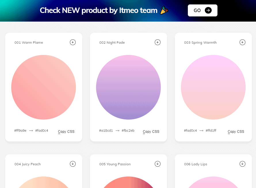
Bonus: A Great Tool to Automate the Creation of Gradient Backgrounds in Android
As I was putting together this tutorial I found a free tool that can speed up this process for generating gradient backgrounds for Android apps.
There is a free to use code generator tool available on the internet called Angry Tools that can be used to generate the code for the drawable resource containing the gradient using the user interface.