
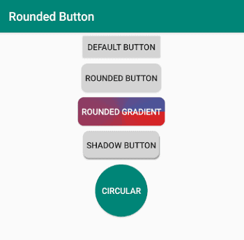
Making buttons in your Android app look nice is an important part of the user experience. As you design and build your app you are likely to eventually want to create rounded corners for your buttons.
Android offers a default button that is not always intuitive to style the way you want, in many cases you will even need to use drawables to get the look and feel you are after.
To create a rounded corners for a button in Android you will need to:
- Create a Drawable for your Button
- Add a Rectangle Shape to your Drawable
- Set the Background Color in your Drawable
- Set the Radius of the Corners in your Drawable
- Apply the Drawable to your Button
- Add a Button to your Activity / Fragment Layout and Apply the Drawable to the Button
In this post I have included code samples for creating a button with rounded corners in Android which you can make use of in your Android app.
In addition to this I have included sections in this post about styling rounded buttons in different ways such as:
- Applying a solid background color to a rounded button
- Applying a gradient background color to a rounded button
- Applying a shadow to a rounded button
- Creating a circular button
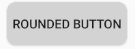
Creating a Button with Rounded Corners in Android
In this section of the post I will show you how to create a button with rounded corners in Android that looks like the image below.
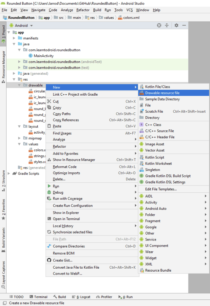
First you will need to create a new drawable resource inside the “res/drawable” directory.
To create a drawable in Android Studio, expand the “res/drawable” directory and right click on the “drawable” folder. Hover over the “New” menu and select the “Drawable resource file” menu item.
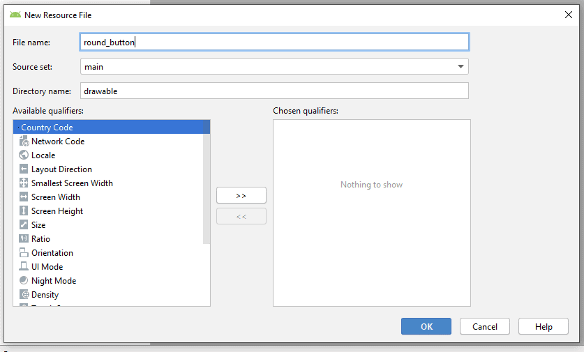
Enter a file name for the new drawable and select the “OK” button. This will create the drawable resource file.
For this button we will be applying a solid background color to it. There is a resource file for centralizing of all the colors in your Android app located in the “res/values” directory called colors.xml, where you can add the background color of the button.
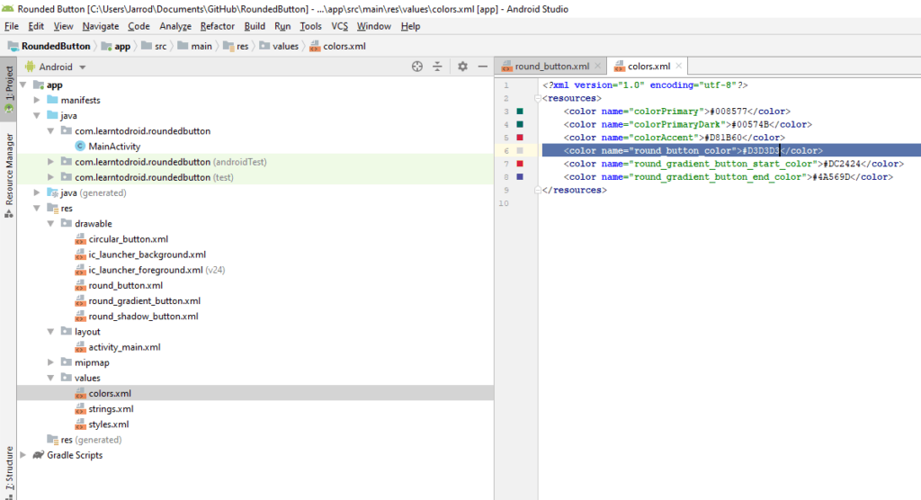
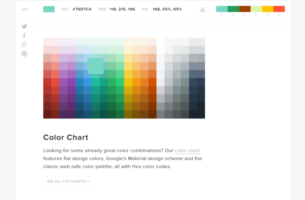
Colors are defined using a hexadecimal value, if you are interested in a useful free tool to help you locate the hexadecimal value for a color check out htmlcolorcodes.com in your web browser.
Edit the colors.xml file in Android Studio and add a new color to be used for the rounded button’s background color. See the code snippet below showing how colors are defined inside the colors.xml file.
Now we have everything we need to create the drawable resource for the button with rounded corners. Open up the drawable resource you have previously creating in Android Studio.
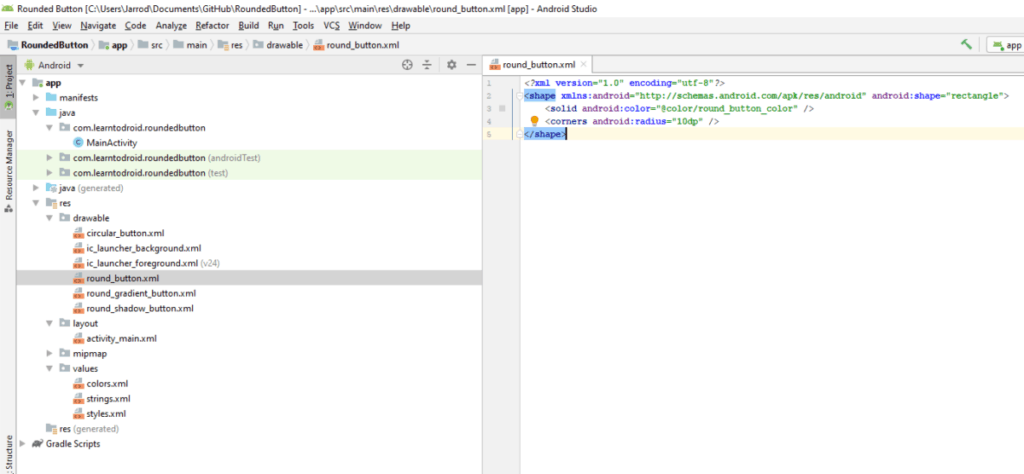
Replace the code inside your drawable resource with the code snippet below. Make sure the “android:color” attribute references the correct name of the color that you created in your colors.xml file.
Inside the drawable resource you will have a shape element, Android supports 4 different types of shape drawables rectangle, oval, line and ring. We will use the rectangle shape drawable for our button with rounded corners by setting the “android:shape” attribute to “rectangle” on the shape element.
Inside the shape element, we will add two elements, a solid element and a corners element.
The solid element is used for setting the background color of the button to be filled with a single solid color. Use the “android:color” attribute on the solid element to set the fill color of the shape to the button color we previously added to the colors.xml file.
The corners element is used to apply a specific radius to the corners of the rectangle shape to create round corners. The radius for the corners are defined in display pixels (dp).
You can apply the radius to individual corners one at a time using the “android:topLeftRadius”, “android:topRightRadius”, “android:bottomLeftRadius”, “android:bottomRightRadius” attributes. Alternatively you can apply the same radius to all corners of the rectangle using the “android:radius” attribute.
If you want to learn more about shape drawables there is a useful developer guide available on developer.android.com that covers different drawable resources including shape drawables.
This will conclude the creation of the drawable, the next and final step is to add the Button to your Activity or Fragment. Open your Activity or Fragment layout resource in Android Studio.
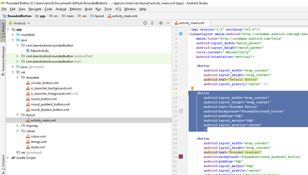
Then you can add a Button to the layout of your Activity or Fragment. When adding your Button use the “android:background” attribute to apply your drawable to the Button. Also use the “android:padding” attribute to give a margin between the text inside your Button and the borders of the Button to give it a better look and feel.
Adding a Gradient Background to a Button with Rounded Corners
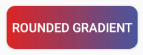
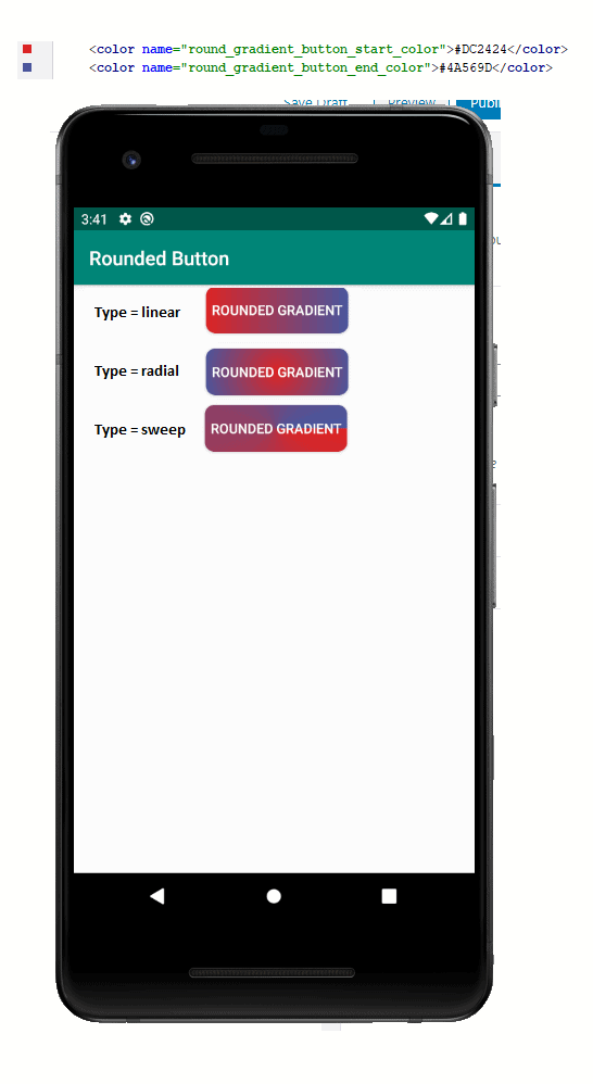
In this section of the post I will show you how to apply a gradient button to a button with rounded corners in Android that looks like the image below.
We will be following the same steps from the section above for parts of this tutorial to create the button with rounded corners so make sure you have read the section above first.
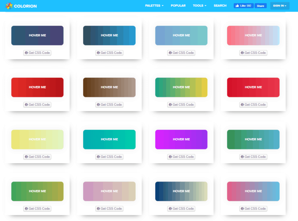
First you will need to create a new drawable resource inside the “res/drawable” directory and give the drawable file a name of “round_gradient_button”.
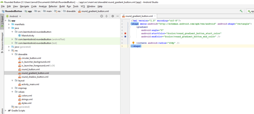
Next we will need to add two colors to the colors.xml resource file located inside the “res/values” directory. These two colors will represent the start and end colors that we will be used for the gradient background.
A great online resource I used to come up with colors to use in the gradient is gradientbuttons.colorion.co. The tool has a great list of colors shown together in a gradient background that you can scroll through if you are having troubles coming up with colors that look nice together.
Once you have added two colors to your colors.xml resource file next you will need to modify the round_gradient_button drawable that you previously created.
Replace the code inside your drawable resource with the code snippet below. Make sure the “android:startColor” and “android:endColor” attributes reference the correct name of the colors that you created in your colors.xml file.
The drawable resource is very similar to what we created in the previous section above, it uses a rectangle shape with a corners element with the radius attribute to define the rounded corners.
The main difference is the use of the gradient element rather than the solid element. The gradient element is used, as it’s name suggests, for defining the fill of the drawable as a gradient of colors rather than a single solid fill color.
In the code snippet I have set the “android:angle” attribute to 0, this means that the gradient will move from left to right. If you want the gradient to move from the bottom to top you need to set the angle to 90. The value of the angle must be a multiple of 45. I have included the image below that shows different angles for the gradient.
Also in the code snippet I have set the “android:startColor” and “android:endColor” attributes to the colors I created in the previous step of this section.
I have not included the following in the code snippet but you can also make use of the following attributes to control how the gradient is displayed.
- “android:centerX” and “android:centerY” which take floating point values between 0 and 1.0 to control the relative center position of the gradient
- “android:centerColor” which refers to a color that is shown between the start and end colors
- “android:gradientRadius” which references the radius shown in the gradient which is only applicable if the gradient type is set to radial
- “android:useLevel” which is to be set to true if the gradient is used as a level list drawable
- “android:type” is the pattern used for the gradient, options include “linear” which is the default, “radial” and “sweep”. I have included examples of each in the screenshot below.
This will conclude the creation of the drawable, the next and final step is to add the Button to your Activity or Fragment. Refer to the code snippet below showing the Button being placed inside the main activities layout resource file.
Adding a Shadow to a Button with Rounded Corners
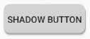
In this section of the post I will show you how to apply a shadow to a button with rounded corners in Android that looks like the image below.
We will be following the same steps from the first section of this post to create the button with rounded corners so make sure you have read the first section of the post prior to starting this.
First you will need to create a new drawable resource inside the “res/drawable” directory and give the drawable file a name of “round_shadow_button”.
Because I will be reusing existing colors, I will not go through the process adding new colors to the colors.xml resource file again.
Replace the code inside your drawable resource with the code snippet below. Make sure that both of the “android:color” attributes properly reference actual colors.
This drawable uses a layer list with two items inside it. The first item represents the shadow and the second item represents the button. The two items contain rectangular shapes with the same radius of the corners but with different colors. Each of the items are positioned differently using the “android:left”, “android:top”, “android:bottom” and “android:right” attributes to allow the shadow to be displayed behind the button.
The next and final step is to add the Button to your Activity or Fragment. Refer to the code snippet below showing the Button being placed inside the main activities layout resource file.
Creating a Circular Button
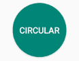
In this section of the post I will show you how to create a circular button in Android that looks like the image below.
First you will need to create a new drawable resource inside the “res/drawable” directory and give the drawable file a name of “circular_button”.
Because I will be reusing existing colors, I will not go through the process adding new colors to the colors.xml resource file again.
Replace the code inside your drawable resource with the code snippet below. Make sure that the “android:color” references an actual color.
The key stand out with this drawable is the use of the “oval” shape in the shape element’s “android:shape” attribute. Another key difference from the previous drawables referenced above is the use of the size element and providing a width and height of the drawable. This is to ensure the oval is large enough so that it is not stretched and appears as circle.
The next and final step is to add the Button to your Activity or Fragment. Refer to the code snippet below showing the Button being placed inside the main activities layout resource file.